Why Responsive Design Is Crucial for Your Website’s Success
In today’s digital era, the importance of having a responsive website cannot be overstated. With users accessing the internet from a myriad of devices, ensuring your website looks and functions optimally across all platforms is paramount. Morfett Designs, a leading IT company based in the United Kingdom, excels in creating responsive, high-performance websites using WordPress, enabling businesses to reach their audiences effectively.
The Rise of Mobile Internet Usage
The number of mobile internet users has skyrocketed over the past decade. Reports indicate that over half of global web traffic now comes from mobile devices. This shift highlights the necessity for businesses to adopt responsive web design to ensure their websites are accessible and user-friendly on smartphones and tablets. At Morfett Designs, we specialise in crafting WordPress websites that are not only visually appealing but also adaptable to various screen sizes.
Enhancing User Experience
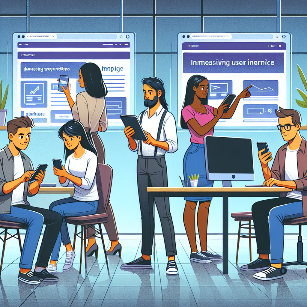
A seamless user experience is vital for retaining visitors and converting them into customers. Responsive design ensures that your website’s layout and content adjust fluidly to fit different screens, providing an optimal viewing experience. Our team at Morfett Designs leverages the latest technologies, including WordPress and design tools like Canva and Figma, to create websites that deliver an exceptional user experience, regardless of the device used.
Boosting SEO Performance
Search engines, particularly Google, prioritise mobile-friendly websites in their rankings. A responsive website ensures that search engines can easily crawl and index your content, improving your site’s visibility in search results. Morfett Designs incorporates SEO best practices into our development process, ensuring that your WordPress website not only looks great but also ranks highly in search engines.
Cost-Effective Development
Investing in a responsive website is a cost-effective solution for businesses of all sizes. Instead of maintaining separate versions of your site for desktop and mobile, a single responsive site reduces development and maintenance costs. Morfett Designs offers competitive pricing for our comprehensive WordPress development services, providing startups, small businesses, and large enterprises with high-quality, budget-friendly solutions.
Future-Proofing Your Website
The digital landscape is constantly evolving, with new devices and screen sizes emerging regularly. A responsive design ensures your website is future-proof, ready to adapt to any changes in technology. By partnering with Morfett Designs, you can be confident that your WordPress website will remain relevant and effective, no matter how the digital world changes.
Custom Design Solutions
At Morfett Designs, we understand that every business is unique. Our custom design solutions are tailored to meet the specific needs of our clients, from e-commerce platforms to informational websites. Using tools like Figma and Canva, our designers work closely with clients to create bespoke designs that capture their brand essence and engage their target audience.
Cross-Platform Mobile App Development
In addition to web development, Morfett Designs offers cross-platform mobile app development using React Native with Expo and Laravel. Our apps are designed to provide a consistent and engaging user experience across both iOS and Android devices, further extending your reach and enhancing customer engagement.
Contact Morfett Designs Today
Responsive design is no longer an option; it’s a necessity for any business looking to succeed online. Morfett Designs is your trusted partner in developing WordPress websites and mobile applications that are both responsive and aesthetically pleasing. Visit our contact page to start your project today, or learn more about our solutions and about us. Let’s work together to create a digital presence that truly represents your brand and meets your business goals.