
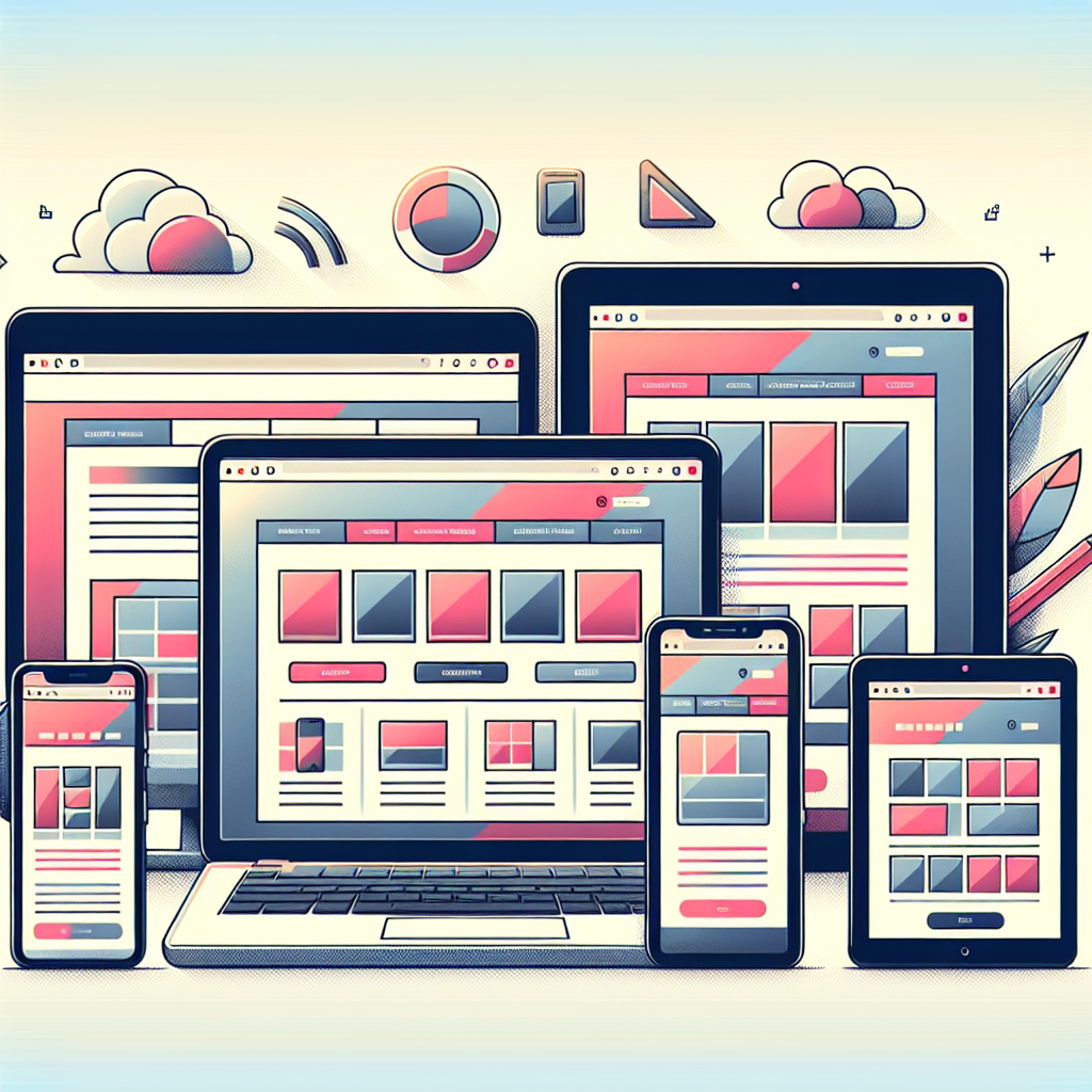
Why Responsive Design is Non-Negotiable in 2025
In an era where digital interaction is at the forefront of business success, the importance of responsive design cannot be overstated. As we move into 2025, the need for websites and applications that seamlessly adapt to any device or screen size is not just a trend but an essential standard. Morfett Designs, a premier IT company based in the UK, leads the charge in delivering responsive, user-centric solutions that cater to the diverse needs of businesses worldwide.
The Power of Responsive Design
Responsive design is more than just a convenient feature; it is a fundamental aspect of user experience (UX) and user interface (UI) design. It ensures that a website or app provides an optimal viewing and interaction experience across a wide range of devices. At Morfett Designs, we understand the critical role responsive design plays in maintaining a competitive edge in today’s digital market.
Enhancing User Experience
In 2025, users expect seamless transitions between devices, whether they’re viewing a website on a desktop, tablet, or smartphone. A responsive design ensures that your content is easily accessible and navigable, regardless of the device being used. This improves user satisfaction and engagement, which is crucial for converting visitors into loyal customers.
Boosting SEO Performance
Search engines like Google prioritise mobile-friendly websites in their rankings. A responsive design not only enhances user experience but also boosts your site’s visibility on search engines, driving more organic traffic to your platform. Morfett Designs leverages its expertise in WordPress and SEO to craft sites that rank highly and attract the right audience.
Morfett Designs: Your Partner in Future-Proof Development
As businesses gear up for the challenges of 2025, partnering with a reliable IT service provider is crucial. Morfett Designs offers bespoke solutions tailored to meet the evolving needs of startups, SMEs, and large enterprises. Our proficiency in WordPress web development, cross-platform mobile app development using Laravel and React Native (with Expo), and custom design solutions with Canva and Figma, positions us as the go-to partner for responsive design.
WordPress Expertise
WordPress remains a powerful platform for creating dynamic, responsive websites. Morfett Designs harnesses the flexibility and scalability of WordPress to deliver sites that are not only visually appealing but also robust and functional. Our team ensures your site is equipped to handle future demands, with features that enhance user interaction and conversion rates.
Cross-Platform Mobile Apps
With the proliferation of mobile devices, having a responsive mobile app is imperative. Using React Native and Expo, Morfett Designs creates apps that provide a native-like experience across multiple platforms. Our development process focuses on speed, reliability, and user-centric design, ensuring your app meets the high expectations of modern users.
Custom Design Solutions
In today’s competitive landscape, standing out visually is as important as functionality. Morfett Designs offers custom design solutions that reflect your brand’s identity and values. Our use of Canva and Figma allows us to deliver innovative and engaging designs that are both aesthetically pleasing and highly functional.
Embrace the Future with Morfett Designs
As the digital landscape continues to evolve, businesses must adapt to stay relevant. Responsive design is no longer optional; it’s a necessity. By partnering with Morfett Designs, you gain access to a team of experts who are committed to delivering solutions that drive success and generate revenue.
Ready to elevate your digital presence? Contact Morfett Designs today to discuss your project needs. Explore our solutions and learn more about us to see how we can help you achieve your business goals.